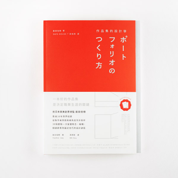
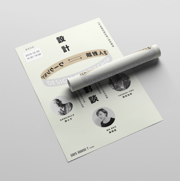
設計 Design
Makoto & Sunao
IdentityVisual Design
Makoto & Sunao
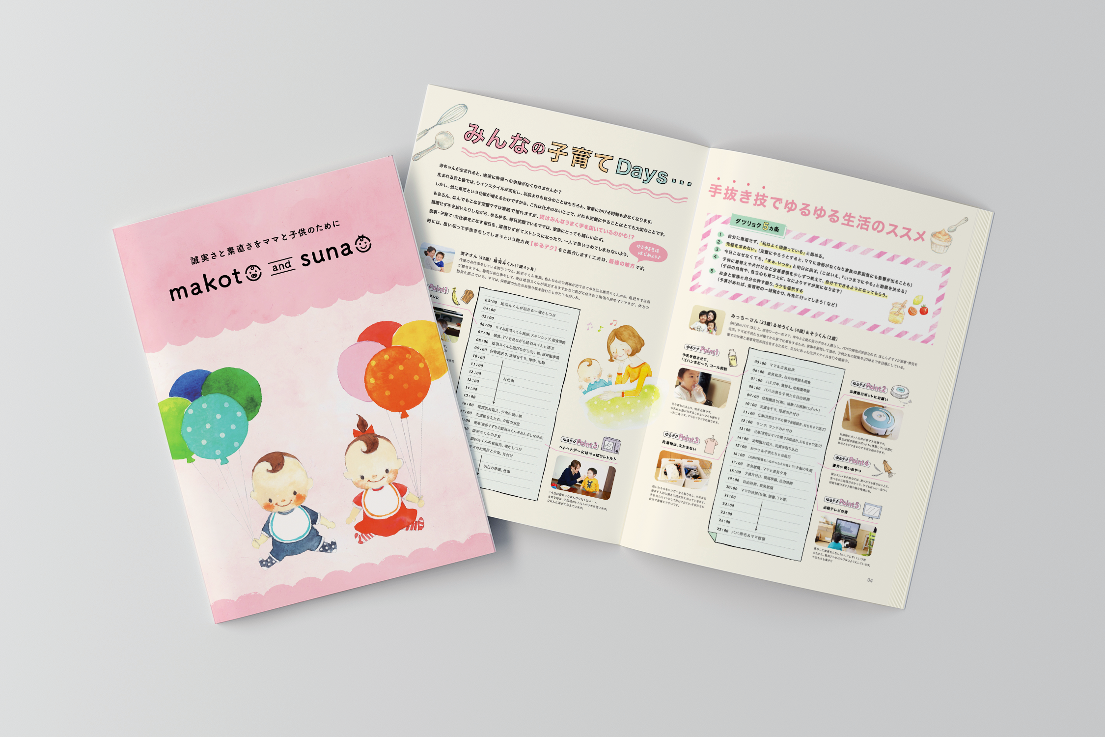
Family-friendly “makoto and sunao” visual design brand. The Japanese words “makoto” and “sunao” represent the brand’s deeply ingrained belief in sincerity and honesty. They also reflect the company’s desire to face our customers with sincerity and earnestly develop our products. As the central theme behind our visual design, the abstract concepts of “makoto” and “sunao” were given form as twins, personifying the corporation’s parental love for their products.
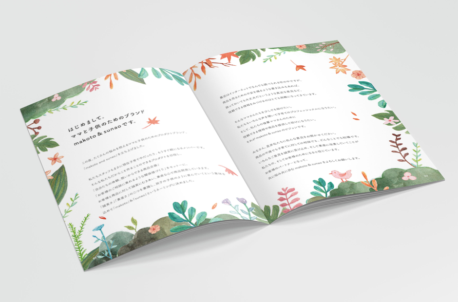
Catalogue Design
