設計 Design
Kaibo Enterprise
IdentityMotion Graphic
Website Art Design

Kaibo Enterprise
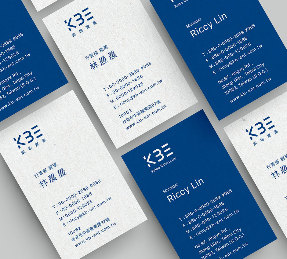
With businesses in construction, food, and business travel, the Kaibo Enterprise reorganized their subsidiary companies and kicked off with a new brand image. The Logo is designed to be professional and features the enterprise’s initials, KBE. The slim yet strong lines emphasize the enterprise’s reliable image.


Visual Identity Design
The logo uses classical yet professional style. The colors and layout use large navy blue text for the enterprise’s new and improved look.

Web Art Desgin
The two subsidiary companies under the enterprise were reorganized, and slim lines of navy blue and baby blue were chosen to enhance the professional image.


