Hello, everyone!Following the continued release of new info and fundraiser of the Kraft animation, we like to introduce this project from the unique perspective of the staff. Showing you the behind-the-scenes fun and hardships behind an animation production.Before we start the interview, we ask each Safe House T (abbreviated as Safe T) member to give a short introduction.
Yao:Hi~~ I am the key animator Chung-Ning Yao, it’s my pleasure to meet everyone!
Ying:Hello everyone, I am Tzu-Ying Wang, in charge of the character design, key animation, and background scenery setting for the pilot film.
Hao:Hello everyone, I am Tsu-Hao Wang, in charge of in-between animation and second key animation.
Hsiao:Hello everyone, I am Wen-Che Hsiao, in charge of key animation, in-between animation, animation supervising.
Lin:Hello everyone, I am Ying-Siou Lin, in charge of in-between animation and partial second key animation.
Hsu:(blushing) I am Chieh-Kai Hsu, in charge of the color design, coloring, and part of the animation.
Su:Hello everyone, I am Chih-Hsien Su, in charge of compositing, coloring, and animation.
Huang:Greetings. I am the background artist Jian-Zhen Huang.
Sun:Hello everyone. I am Chia-lung Sun. I acted as the animation director and executive director for the Kraft pilot film.
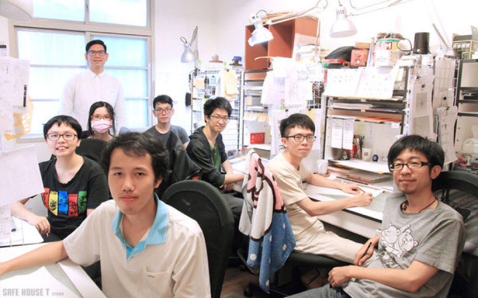
Thanks for the introduction everyone! Now let’s get on to introducing this project!
As we all know that pre-production work like character, background, and color design have to be done before entering the in-production stage.Starting from Kraft’s animation, we’re giving the first question to Tsu-Ying Wang, who is the character designer for the pilot film. Which areas do you pay extra attention to during the process of designing and did you encounter any difficulties?
Ying:Actually, before the pilot film had any character design, Doom Boys (later renamed as Kraft) already have its own version of the character designed. Studio REALS also already started on parts of the animation using the previous designs. Even though numerous materials had to be redesigned, we tried to keep the balance by following the original design’s tone. For example, I try to retain the original character’s design elements as much as possible while improving upon them; such as the hairstyle and accessories.
Initially, how was the animation style of the pilot film that we see today decided?Some online fans argued that the character Shaw seemed rather feminine. In the original design, Shaw actually appeared to be more masculine. What are your thoughts on the differences between the two versions?
Ying:Some of the reasons behind this decision included the lack of female characters within the pilot film, which is why we made Shaw into a cute younger brother archetype to balance it out. The stylistic choice is mainly to essentiate the performing animation, simplifying the character design in order to make it easier to animate and reducing the amount of time spent on the details.
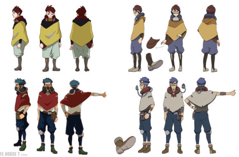
The left is the initial profile of Doom Boys while the right is the basic design version.
(Copyright © SAFE HOUSE T & Studio REALS )
Next, we’re going to shift to the color designer Chieh-Kai Hsu.Are there any notable spots on the color design that you would like to highlight for us?
Hsu:World settings often affect what characters wear and their colors. There was also an original design for coloring as well, but the original design’s colors weren’t matching the world that was being delivered. Therefore, when we redesigned the colors, I carefully studied lots of world settings data that Studio REALS generously provided, as well as gathering data of my own. It aided me in planning the rearrangement of colors.
Can you be specific about the direction was taken?
Hsu:For example, the two characters come from different backgrounds. Shaw was the son of the village chief, while Lantez is a peasant in the security force. However, both characters wore rather fancy colors in the original design, so I rearranged the color tones during the new color design.
Lantez is a peasant, but his cloak was an eye-catching red. Therefore, it was edited into a more uniformly plain color. Shaw, on the other end, retained the vibrant colors. Other accessories were designed with the desert environment in mind, with variations of color saturation. After the base colors were designed, we had to create a variety of color themes matching the underground and underwater scenes in the pilot film.
How many different variations of color themes are there total?What environments do they appear in?
Hsu:Including an unused color variation, there was the tunnels, factory, underwater, and a factory scene where the environment changed so we had to make a brighter version. Finally, there was the scene with the D-4 robot in the engine room that required another set of color theme. In total, about 5 to 6 color theme variations.
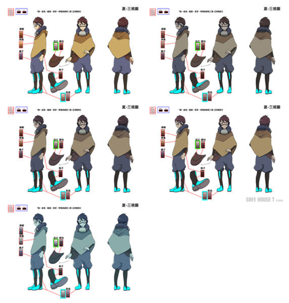
Various versions of Shaw’s color design.
Top left is the original while the others are in used with different environmental lights.
(Copyright © SAFE HOUSE T & Studio REALS )
Next, we would like to ask the animation supervisor Wen-Che Hsiao and see how he feel about the pilot film.
Hsiao:This is my first project as the animation supervisor.First, I would like to briefly introduce the position of animation supervisor, commonly known as “animation check.”This job ensures the quality of the in-between frames of the animation matches that of the key animation and whether it faithfully adapts to the original key animation design and performed the action and mood correctly.
There was once an intern in charge of an animation cut but wasn’t able to perform to expectation due to inexperience. The baton was passed to our animator Ying-Siou Lin and the final results were vastly different. It was an incredibly memorable realization that whether or not in-between frames follow the original intent of the key animation could impact the animation as a whole so heavily.
Continuing forward, let’s ask the background artist Jian-Zhen Huang about his involvement with this project.
Huang:I am in charge of the background art of the pilot film.Using this chance to answer a question that many friends on the internet have been asking,“why was the art style of the pilot film so different from the concept art that was being advertised at the same time?”This is actually a two-part answer.The first reason is that chronologically, the pilot film animation began before the concept art. (smiles bitterly) Due to timing constraints, we chose to follow the original art style of Doom Boys.
The second is that the pilot film revolves around the scene where the two characters enter unexpectedly into an advanced ancient civilization. The backgrounds for this area appears to be more high-tech.Therefore, it differs from the overall post-apocalyptic world that the illustrator Chang- Ching Yeh was trying to portray.
I’m also using this chance to take a jab at our animation director. (laughs)This project planning didn’t have any preproduction data or time. All I had to work with was the original layout (known as LO), so the backgrounds had to raise the level of details and completion rate, not to mention many corrections due to the animation.Let’s end our years of friendship right here while we’re ahead! (╬☉д⊙)
Sun:Aww, don’t be like this Huang.Didn’t I pull all-nighters alongside you too~ I know you’ve worked hard! (^^;)
Huang:hehehe~
Now let’s get back to explaining the details of the backgrounds in the pilot film.
(Copyright © SAFE HOUSE T & Studio REALS )
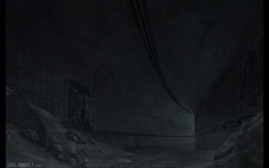
Huang:Let’s take the tunnel background for example. It’s a ruin left behind by an advanced civilization.The lens is looking through the eyes of Lantez as he falls into this tunnel, using the light source to lead your line of sight into the distant tunnels.
This scenery is a closer representation of the actual environment of the world outside, thus the level of destruction is somewhat higher. The main focal point is the background being closer to the character, such as the rock, dirt, and pipeline. The pipelines retained a worn out feel in stark contrast to the high-tech scenes to come.
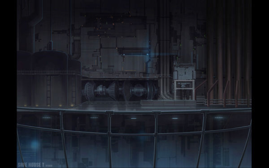
Huang:After passing through the tunnels, we come to our first scene with the high tech ancient civilization. Briefly explaining this scene, this is a wide shot view of the background, with the main purpose of revealing their advanced technology. The light source indicates that part of the ruins is still functioning.
(Copyright © SAFE HOUSE T & Studio REALS )
Huang:Once again I bring up the issue of not having enough pre-production data. I had to improvise on this scene due to the lack of details, including objects that didn’t seem to belong, like buckets, ladders, hoses, and strange pipelines. (laughs sadly) I rearranged the objects, designed the spatial relation, and the direction of the light source as I drew this.
Yao:I admit the original drawing didn’t have a lot of details. ・゚・(ノД`)
The LO wasn’t done very well. Due to Studio REALS’s earliest background draft had a much narrower viewing angle, I wanted this cut to give a sense of space. Not to mention this scene is directly related to the other cuts, so I did an extra overhead view to explain the spatial relations.
Huang:Once everyone compares the finished background versus the LO, they should know how much work the background artist had to do. (laughs)
Yao:………(QAQ)
Sun:Let me add a few encouraging words of support for Chung-Ning (Yao).
The initial background and data didn’t have a sense of spatial awareness, so it couldn’t be used as “background setting.” Rather, it was closer to a concept. When production started, we had to reorganize the scene from scratch. Therefore, it was very taxing on the animators, background artist, and key animators. Under limited resources, they had to fill in the lacking details on top of their work.
It was a great job done by everyone!
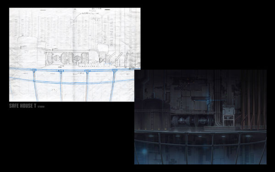
The comparison between the LO versus the completed background in the C10A cut.
(Copyright © SAFE HOUSE T & Studio REALS )
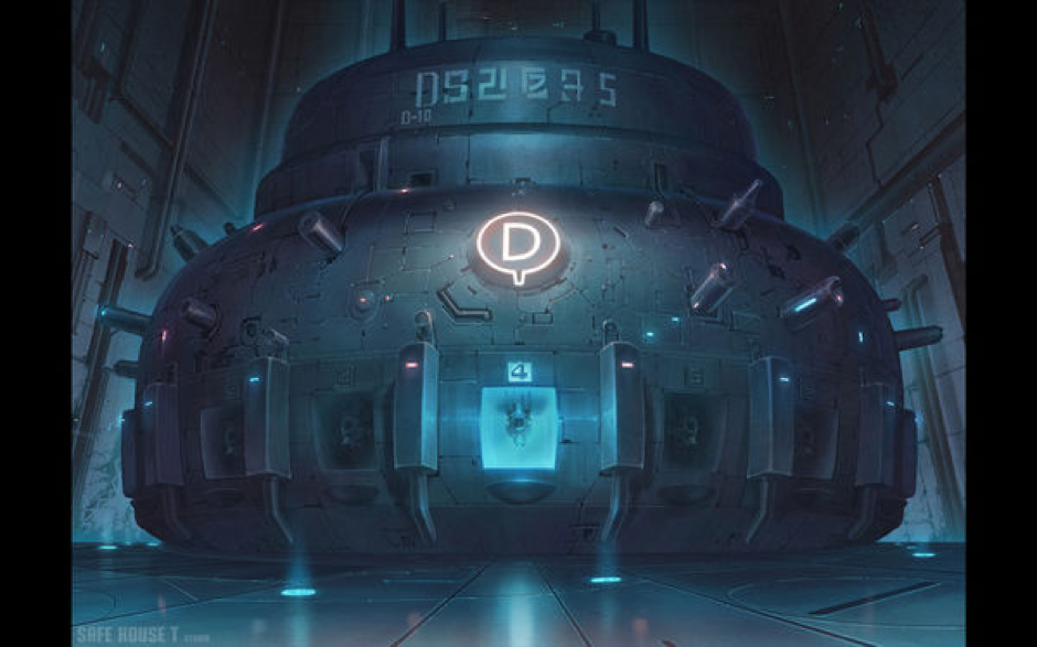
Huang:Another cut is the robotic storage facility background seen from Shaw’s perspective.This scene’s surrounding contains aquatic plants with a dark atmosphere surrounded by ghostly lights. The purpose is to make the little robot in the center a distinct focal point.
(Copyright © SAFE HOUSE T & Studio REALS )
The 25 seconds clip revealed is put together as a montage. However, as a whole, the video starts with earthly colors before moving to a blue hue in the end.Is the high-tech atmosphere designed in such a way to introduce the robots?
Huang:In terms of the storytelling, yes. The background hues were designed to suit the needs of different locations and plot devices. Though in actuality, the work of a background artist is supposed to coordinate with the LO, the overall tone and mood were set by the animators’ and myself through constant discussions and revisions.
So far we’ve discussed this project through the character, background, and color design perspective. Next, we would like to ask about the actual visuals of the pilot film. Would the staff like to kindly explain some of the details during this?
First is the chase scene against the G-Bugs. The one with tons of little robots chasing the protagonists up to the bridge.
Yao:The most difficult part of a chase scene is the camera movement and flow of action. The storyboard doesn’t give any directions on camera movements. Personally, I wanted to present a tense and thrilling mood, so I simulated a handheld camera movement. The animation and camera movement of the chase scenes were actually designed together.
Sun:An animation project requires an accurate spatial setting in order for the characters to perform, which is why the backgrounds need to be especially precise. I remember some of the key animators also assisted in organizing the background settings and parts of the concept design. That’s why you can see our credit list has a position for background scenery setting.
Anything of interest to share when it comes to animating running characters?
Yao:The character profile states that Lantez is part of the security task force, which naturally means having a better athletic sense and a calmer demeanor when in danger. Shaw, on the other hand, is more of an inexperienced boy. I wanted to portray Shaw’s fear and unstable pacing when faced with a threat. Lantez ran behind Shaw in order to protect him.
The robots animation is another shocking aspect of the pilot film. It’s all hand-drawn, correct? Why would you choose to use hand drawn animation for these numerous little robots? Wasn’t it really hard to accomplish?
Yao:Well, you’ve just mentioned my troubles. (laughs)
During production, I started with the robots and characters’ LO in order to reduce the burden on the animators. In the end, we still asked 3DCG specialists to help us path the robots’ routes with 3D models. I referenced the 3D models to finish 2nd key animation and fixed it accordingly alongside our 3DCG staff.
From communicating with our 3D staff to fixing to the in-between animations took nearly a month. It was a really hard cut to draw. (இдஇ)
Sun:When an animation director and a 3DCG staff work together, the key to success lies in the LO’s accuracy. For example, this cut uses an overviewing and slightly wide angle. It was difficult for the 3D staff since the original design and simulated space and perspective weren’t up to a realistic scale. 3DCG is more factual and calculated and is limited by the software capabilities. We had numerous discussions and edits before reaching the current completed image that you see.
Ying:Speaking of robots, the cut with G-bug attacking was rather difficult.
Ying:The original storyboard had the robot jumping out from the right side. After discussing with the animation director, we decided to readjust the cut with G-Bug as the centerpiece. The action also changed into walking, turning, then jump straight at the camera to create a level of depth. The robot in the back and the entire scene used a long shot with different layers containing different G-Bugs walking in place. Each G-Bug has a different pace and was compiled together to show the differences.
Yao:I remember the entire storyboard was revised.
Ying:Indeed. This cut originally also included the two protagonists running away. Later on, it was dealt with separately in order to make this camera shot much more appealing.
Su:Having to draw its spherical shape without distorting it for in-between animation was a very large challenge. It would be glaringly obvious if any distortion occurred.
Next is the scene with the explosion on the bridge. Can Tsu-Ying (Ying) elaborate his thoughts when drawing this cut?
Ying:The plot behind the scene is the two protagonists installing mines on the bridge, then hid behind the short wall to detonate it as the G-Bug ran across. Destroying or dropping the G-Bug down the pit. For the special effects of the explosion, the mines were designed to be ancient high-tech gadgets left behind by the civilization before. That’s why I added some light beams gathering to enhance the sense of advanced technology, rather than just smoke and fireworks.
Were the effects of the mines designed at the very beginning?
Ying:The mines and other accessories didn’t have detailed settings to them originally. It was mostly me who made the changes as I was drawing. The original storyboard had a rather flat perspective. In order to give the explosion more depth, the LO was changed to a worm’s-eye view with the bridge given a steeper slope.
It’s rare to see hand drawn explosive effects in Taiwan. Were there any difficulties you have had to overcome?
Ying:It may be hard to tell after coloring, but the flames and smoke actually have a lot of details. An explosion is an ever-morphing ball of air. When arranging the layers of the explosion, we start with the translucent lighting, then small envelop it with flames while the end tip of the smoke would be lower in temperature and darker in color. The lighting in the darker smoke has a larger surface of highlight, unlike the fragmented ember smokes.
Building layers using this method, the in-between animation also needs to have an understanding of explosions and make sense of the animation using their imagination. I believe it’s a very hard thing to do.
Hsu:Similar to the animation, coloring also have a lot of details. The lines get removed during the coloring stage since the lines themselves have a certain thickness. We have to think in terms of volume when coloring and adjusting. We had to constantly double check the light and dark surfaces and spend the time to think about each frame individually.
Su:Although the animation and coloring are really difficult, personally, I rather enjoy these type of special effect cuts. Despite having a base color determined by the colorist, it was a fun challenge for the compositor to reenact that powerful light source and explosive tension. When played in slow motion, you can see a lot of special effect lighting like white and high contrasting red appearing all but an instant. The most exciting part, however, is that single explosive instant. For it delivers the audience an entirely different visual experience.
Another fun fact is that the colors before and after the explosion have been adjusted. Due to the high density of heat after the explosion, the surrounding area becomes redder in hue. All this has to be thought out logically by the compositor.
Sun:The original storyboard for the pilot film has the mood of an opening act. It contains more dialogue between characters rather than action performances. I wanted to increase the variety in both the visuals and animation, and thus the explosive scene was born. On one side, the director has been lenient in adding extra scenes or shifting the focus on scenes. On another, even if the explosion is but a brief instant, as long as it brings value to the scene; even if it’s rather taxing for the animators, we won’t be avoiding it.
During the process of drawing, several versions were attempted. Although seeing it from the slight worm’s-eye view perspective, things just seem like a ball of light, fire, and smoke. It still brought out a naturalistic feel. Every instant was designed with great care.
Ying:Yes, just as Mr. Sun mentioned, initially we drew lots of animation drafts of different explosions. We chose this one in the end. It was challenging for me since it was my first time drawing explosive effects. When I first started the rough draft, it was hard to imagine how to give dimensions to a ball of air. I went through a ton of films, books, and repeatedly study explosion scenes. Finally, I have to give thanks for the edits made by the animation director to deliver such a thrilling explosive scene.
Sun:In-between animators also faithfully adapted to the key animator’s vision, finishing this cut beautifully!
After the explosion scene, another difficult cut is the background for the collapsing bridge. Are there anything specific you would like to mention?
Ying:This cut is actually used alongside cut 72. It shares the same lens and some of the same layers. Due to the complexity of the animation, there’s a total of over 300 sheets of animation paper used.
Over 300 sheets!? @@;
Ying:(troubled laugh) There is a total of 10 separate layers. We divided the characters’ action, special effects, and miscellaneous items. For the sake of post-production compositing, the bridge, lower pipelines, and pillars are all background animation that needs to fit in with the background. The LO has to be very accurate in order to fit in seamlessly.
Su:If you fill in the colors of the background animation, it’d end up simply as pure color blocks. But as you can see, our background is incredibly detailed and we tried to bring in that sense of refinement into our compositing. We matched the background animations to the background frame by frame to make the texture as seamless as possible.
Huang:Aww, I feel all embarrassed hearing this. (*´艸`*)
The cut with the collapsing bridge is one of the highlights of the pilot film. We chose a worm’s-eye view to create an imposing atmosphere. At first, it was drawn darker but was critiqued by the animation director that it needed to be more imposing, so we weakened the environmental lighting and allowed some main light source to come in from the fan. The pipelines and metal texture took quite a while as well, but we couldn’t have it steal the spotlight from the characters’ actions, so we controlled a number of details shown.
Though in the end, it seems to still be rather eye-catching, haha. (◔౪◔)
Ying:It was harder to center around a focal point with the positioning of the character within the storyboard. The key animator had to put into consideration that this is where the intense scene of the chase came to a pause, where there is a brief reprieve and the two have the upper hand. Which is why the worm’s-eye view is introduced. Also to provide extra space to enact the collapsing bridge later.
At the same time, the shared cut had the original scene setting while we improved upon it to make it all the more imposing. The two cuts had entirely different characteristics but had to be used in the same scene, which was very challenging to design.
The smokes were full of challenge to animate as well. We wanted to make the smoke feel like unveiling the curtains to a new scene. The smoke from the foreground differs in animation from the background as well. While the smoke on the bridge is created by the high temperature, the smoke in the foreground was mixed with gunpowder and dust from the bridge, which we had to differentiate within the animation.
Were there any memorable things to mention for the in-between frames?
Lin:I am the animator, Ying-Siou. Aww~ It feels awkward to say my own name. (*´艸`*) Haha. My thoughts on this… umm… it was simply difficult. (⁄⁄•⁄ω⁄•⁄⁄)⁄
Sun:I remember this cut had quite a few in-between frames to do, right?
Yin:Probably just the smoke on the bridge. It required quite a number of frames to loop it.
Su:I drew that loop. It took me an entire week! (cries)
Yao:It wasn’t just the in-between frames. It’s because the morphing shape that makes it hard.
We just mentioned that this cut and the bridge collapsing is used twice. Now let’s talk about the collapsing shot.
Yin:This is my first time drawing a background animation cut. In terms of performance, there is still plenty of room to grow. I am satisfied with the bridge collapsing in the back and the debris of the bridge. There were a lot of trial and errors in the key animation due to the characters being smaller and had to match the rate of the bridge collapsing.
The difficult part is the lack of structural design data for the underside of the bridge. We had to think about how this bridge was built, analyze the pieces of cement, the steel frame, and the area between the steel beams. It took a lot of time to improvise this setting because we needed to make different textures and pace the collapse between different materials in order to fully enact the scene we wanted.
Sun:These two were both length cuts with lots of seconds. A lot of discussion with the key animator went into maintaining the tension within this time frame. Especially since this cut has a lot of texture and complex structures. It’s a difficult task designing the time frame to match up with difficult materials.
Yin:The hardest part of the collapse is to find the point of origin. A certain steel beam has to bend first, then weight begin to gather at that point, and eventually, it collapses. The bridge in the back is affected by the explosive shockwave and becomes slightly damaged, while we can see the revealed cables, divided beams, and smaller debris in the center.
It takes the incredible skills of our animators to figure out each debris and draw in consistent volume with such precision. Thank you, everyone! d('∀')
Lin:This part was rather confusing for the animators because there were different rocks falling from different places. I had to separate out the movement of each rock. Sometimes I would go “Eh? Which rock was I on?” and revisit the frames once more. (´;ω;`)
Hsu:I’d like to mention a little something when it comes to coloring. While we mentioned different materials earlier, the coloring process uses temporary colors to break down the details. It makes it easier to match the backgrounds when we change the colors later. At the time, I was researching all the possible color layers and praying that the background doesn’t exceed the expected range. Luckily, it didn’t exceed it.
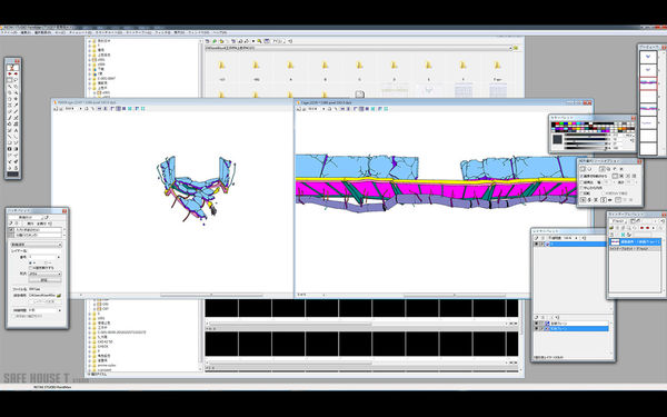
When we’re coloring, the backgrounds use different temporary colors to differentiate each section.
(Copyright © SAFE HOUSE T & Studio REALS )
The background didn’t draw out the bridge. How were the colors coordinated?
Hsu:I referenced other background scenes that had bridges appearing and selected similar colors. I had to rely on our master compositor to make the adjustment for any remaining difference in color.
Su:Master compositor! (≧∀≦) This cut has a lot of separate layers, so a number of changes could be made. For example, like how the characters didn’t have backlighting initially, the texture of the bridge itself, and the adjustment of the light and shadow between the collapsing debris and light source. It’s because the animators have divided the layers out that we could make such detailed post-production work.
Sun:A large portion of this was done under the condition of insufficient storyboarding and settings. Every position had to fill in the gap using their professional knowledge to enhance this scene.
Especially since the animation, background, coloring, and compositing were all done at different intervals, so the staff really needed to communicate and have a tacit understanding. Each of them needed to know their position, predict future problems, and cover for each other within their professional duties. The animation needed to use their experience to predict the unfinished scene and balance it with the previous and latter cuts. This cut is a great example of everyone’s tacit understanding and professional spirit!
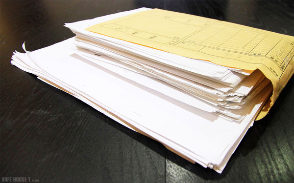
Everyone’s hard work. Includes over 300 sheets of animation paper.
(Copyright © SAFE HOUSE T & Studio REALS )
To be continued ! d(d'∀')
文字撰寫|MK
圖像版權所有 |SAFE HOUSE T & Studio REALS

